Introduction
A reusable component is a complex set of components and styling elements, saved to your toolbox. There are 2 main reasons for which you would want to create one:
• to use it on more than one page
• to simplify the structure of a page while designing the specific section in the reusable component
In this example, we are creating an account card. It will be used in the opportunity detail page, and in a version 2 of Account List.
.png)
.png)
Step-by-step instructions
1. Setting Up the Account Card Reusable Component
After adding our “customer” field, from our Opportunity Aggregate, to our “opportunity“ page, we’ll create our reusable component:
a. Open “more” in your explorer project panel
b. Right click on “Components”
c. Select “add component”
d. Type your reusable component name.
For our example, we’ll name it “account card”
the name has to be unique to this project.
.png)
2. Associating Data to the Reusable Component
We need to associate data to the reusable component editor with the data type we plan on using. For our example, it’s an account’s data. To apply our data source, and ensure that it was successful, we will add the account “name” field and open the designer mode.
.gif)
In “set data source” we enter:
db.Account.all.first.gif)
3. Adding Fields and Styling to the Account Card
Add fields and styling to create the look you want for your reusable component. Here, we added the name of the account, its website, the city and province, the relationship, as well as the industry and an icon.
.png)
4. Implementing Conditional Display for VIP Accounts
To only display the “star” icon when the account is VIP, we added a “show/hide” behavior:
.gif)
5. Dragging and Dropping the Reusable Component to the Page
Our reusable component can now be found in the Toolbox, under “My Project”. We simply need to drag and drop it to our opportunity page and add a behavior “set component data”, of type field, to the component. For our example, the field is “customer”.
.gif)
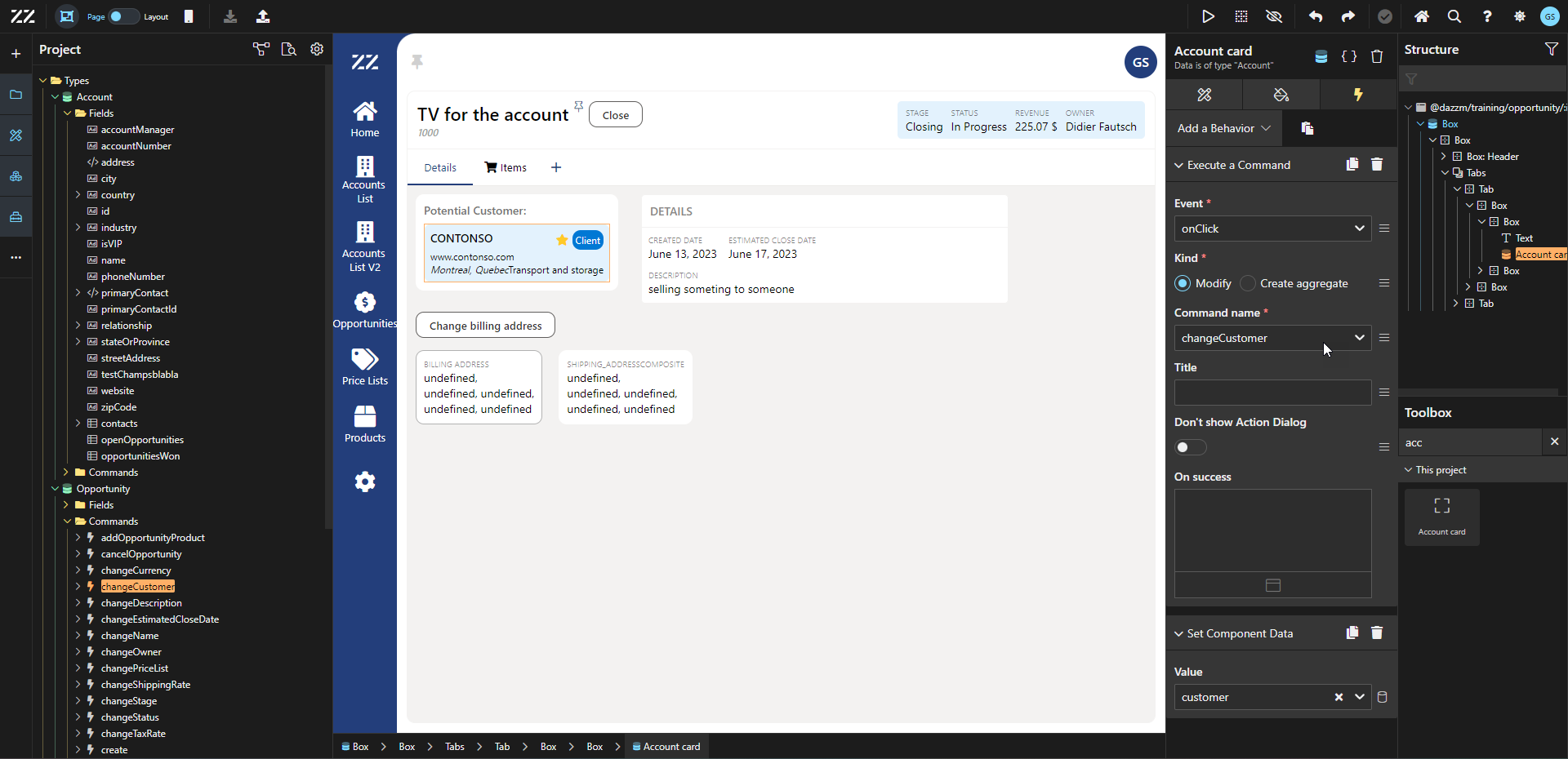
6. Adding Customer Change Command to the Component
We’ll add a “change customer" command to our component, so that when a user clicks on it, they can change the customer associated to the opportunity. Keep in mind that the Execute a Command behavior should be before the Set Component Data one.

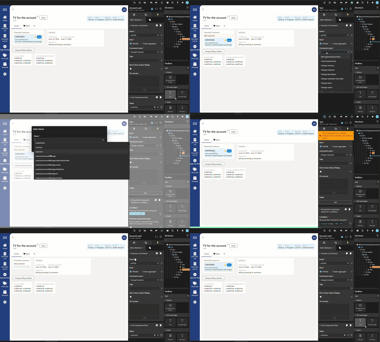
7. Enabling Customer Addition for Unassigned Accounts
We will include an option to add a customer if none has been set yet. To do so, I add a Text component from the toolbox (with the value “Add customer”) above my Account Card component and add a Execute a Command behavior, on click, Change Customer. To make it the text only visible when no account has been selected, we add a Show/Hide behavior as well. To hide the Account Card component when not needed, we also add a Show/Hide behaviour on it, that we place at the top of the list of behaviors applied to it.
 Conclusion
Creating a reusable account card component simplifies the process of adding structured and styled account information across multiple pages. By associating relevant data and incorporating flexible behaviors like show/hide conditions and commands, this reusable component enhances the efficiency of page design and user interaction.