Introduction
Let's see how to use “save page data” and “show/hide component based on a condition” to show or hide an element. This could be another icon, a box, or even text. For our example, we'll make sure that an information section can be collapsed and opened by clicking on an icon. We'll also make the icon vary according to its function.
.gif)
Before you start
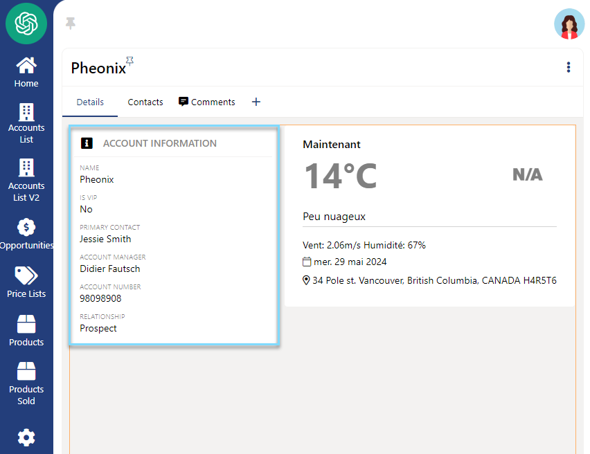
First, we need a page with an information panel consisting of a section for the title and a section with our fields.

Step-by-step instructions
1. Adding an Icon for Collapsing and Expanding Sections
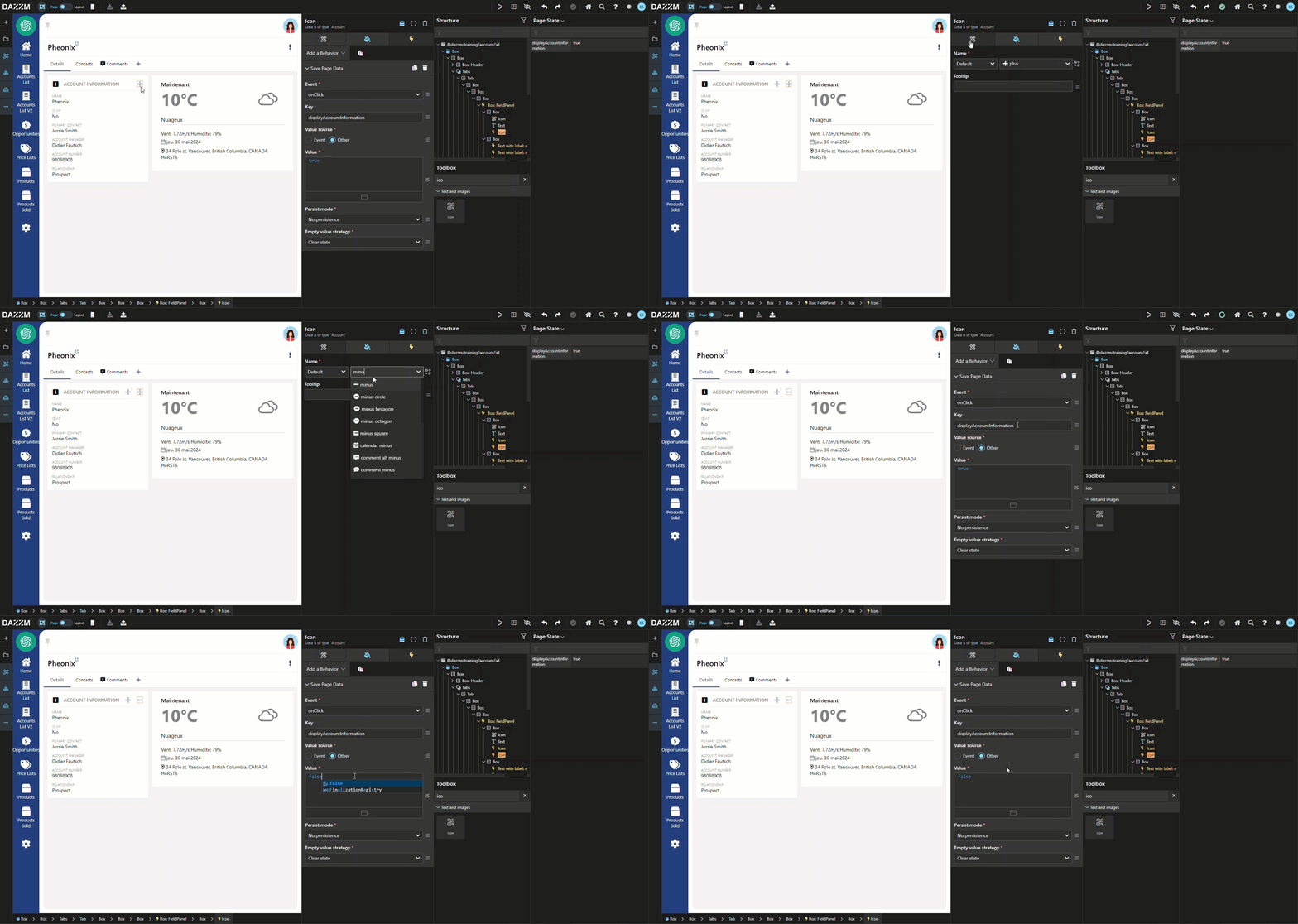
Drag an “icon” component to the right of the text in the “title” section, change the icon to “+” and align it to the right. (For this example, I've changed the icon color to “bluegray200”).
.gif)
2. Configuring the "Save Page Data" Behavior for Session Management
Add a “save page data” behavior to the icon to save data on the page during the session. Choose to apply the change at the moment of a click with the key: displayAccountInformation. Choose “other” under “value source” and add “true” as the value in JavaScript mode.
.gif)
Additional Tips / Notes
You can consult the list of our “Page States” from the menu “...”, “state”, which opens a panel on the right of your structure:

3. Duplicating the Icon for Alternative States
1. Duplicate the “+” icon, then change the icon to “-” and its value to “false” in “save page data”. *** Remove “align right” from this new icon to visually have one icon replace the other.

4. Implementing Show/Hide Logic Based on Page State
Add a “show/hide component based on a condition” behavior to the box containing the fields. Change the mode to “PageState” and choose the “pageState” created in step 2.
If you don't see your “page state” key in the options, simply switch to Live mode and click on one of the “save page state” icons. Both icons will work from then on, but both will be visible simultaneously.
.gif)
5. Managing Icon Visibility with Conditional Behaviors
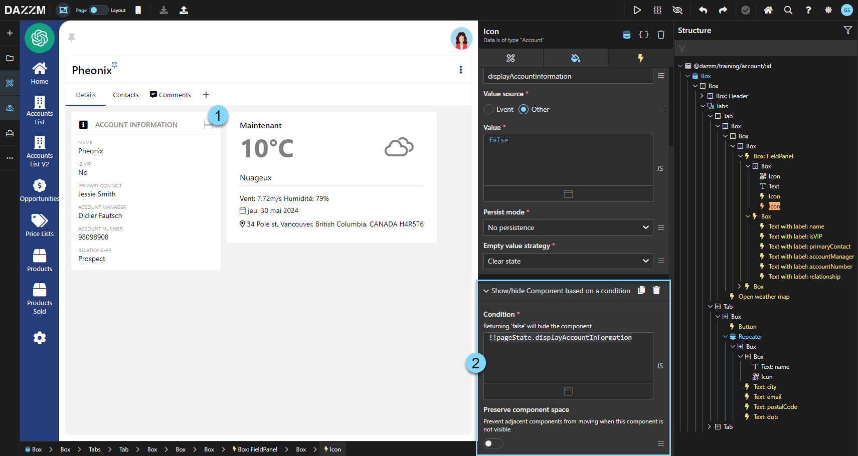
To hide the icon of the unavailable function, add a "show/hide component based on a condition" behavior in JavaScript mode:
On the “+” icon: !pageState.displayAccountInformation
On the “-” icon: !!pageState.displayAccountInformation

Additional Tips / Notes
Using a Single Icon for Both Show and Hide Actions
If you wish to use the same icon to display or hide a section, simply add a “behavior” of the type “save page data”, “onClick” with the key of your choice (e.g. displayAccountInformation), source value “other” and in JavaScript mode: !pageState.displayAccountInformation
Conclusion
This guide explains how to implement show or hide functionality for a section on a page using icons. By configuring icons with appropriate behaviors and page states, users can toggle visibility of content dynamically, providing a clean and interactive user interface.
.gif)