Introduction
In mobile design, navigating to a separate detail page can disrupt the user's flow, especially when exploring multiple list items. Sliding drawers offer a sleek, in-context alternative by allowing users to view details without leaving the list. This approach improves usability, streamlines navigation, and enhances the overall experience.
In this guide, we’ll walk through the steps to implement sliding drawers effectively, ensuring that users can explore details effortlessly while staying within the context of the main list.
For example, consider a functional page displaying a list of accounts. Instead of redirecting users to a separate page, clicking on a restaurant can trigger a sliding drawer that displays its details within the same screen. This not only keeps users engaged with the list but also provides a smoother, more intuitive experience.
Before you start
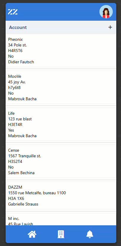
As a starting point, have a functional page displaying a list. In our example, it’s a list of accounts:
.png)
Step-by-step instructions
1. Select data from the list
We must add a “save page data” to determine which account has been selected. Add the behavior to the first box within the repeater of the mobile list page. The behavior should be triggered on click and set an “accountID” key. The value source should be “other” and the value should be in Javascript.
data.id.png)
2. Create and Configure a Drawer to open and close
To create the drawer box from scratch, drag and drop a box component either above or under the repeater.
Set its Width to 100% and height to 80%.
Then, add an X icon in the box and align it to the right. This will become the user’s exit button. To clear the account selection when they click the icon, add another save page data. The behavior should be triggered on click and reuse the “accountID” key from step 1. The value source should be “other” and the value should be “null” in Javascript.
.png)
At this point, when an account is selected, the drawer slides into view but is still a blank page and clicking the close button hides the drawer.
3. Configure the Sliding Drawer to display content
Use the selected account ID from the save page data to link the account's details to the drawer box. To do you, add a set component data to a new box within the drawer box.
Remember to limit the record to 1 with “use single record”.
.png)
Style the drawer and content box with icons, background color, margins, etc.
.png)
4. Optional: Add a Blur Effect to the background
To blur the list while the drawer is open, create a box with the following Styles:
Width: 100%
Height: 100%
Apply this CSS and apply the content alignment to the bottom
.png)
& { backdrop-filter: blur(10px); }.png)
Add a Show Component Based on a Condition behavior to the blurry overlay, triggered by the accountID key.
.png)
Then, we need to apply “positions” so this box only hiding the list. Place the drawer box inside the one with the Blur effect and add a “detached layer - absolute” position to the blurry box.
.png)
And finally, select the parent box and change its position to “position anchor - relative.”
Conclusion
Sliding drawers provide a modern, user-friendly alternative to traditional detail pages by enabling users to view details in context without disrupting their flow. By implementing page data management, a responsive drawer design, and optional visual enhancements like blur effects, you can create a seamless and engaging navigation experience that improves usability and keeps users focused on their tasks.