Introduction
By default, when using mobile pages created by the platform in a PWA[1], the side panels won’t keep out of the safe area, creating usability issues for users. In this How To document, learn to fix that issue for both default pages and custom pages. Also learn how to create a custom mobile layout and create a navigation menu. Finally, see how easy it is to take a page designed to fit with the main layout and adapt it to a mobile layout.
.png)
.png)
Step-by-step instructions
1. Identifying the Safe Area Issue on Mobile
Start by opening the PWA on your mobile and the mobile home page on the platform. Open the PWA side panel by taping on the top-right button, to see that the mobile Safe Area is not taken into consideration (see second screenshot).
.gif)
.png)
On the platform, switch from page designer to layout designer. Select the “UserMenu” box from the Structure panel of the platform. Then, from the Attribute tab, add “data-layout-mobile” in the Class Name field. This will immediately allow the safe area to be recognized from the PWA, thus allowing the user to easily access all panels and buttons from the mobile app.
.gif)
2. Creating a Mobile Layout and Applying It to Existing Pages
The following steps will show you how to create a mobile layout, apply it to an existing mobile page, copy a side panel from a desktop page to a mobile one and adapt it for the Safe Area.
a.From the Project Explorer panel, go to “More” and right-click on the Layout folder. Then, select “add layout”. Type a name for the new layout and save. From the Properties section, activate “in mobile”, then find your home page (mobile) and pick your new layout from the dropdown menu of the same name.
.gif)
b. From the bottom section of the style tab, remove the default CSS from all the components of the page.
.gif)
3. Setting Up the Grid and Header for Mobile Pages
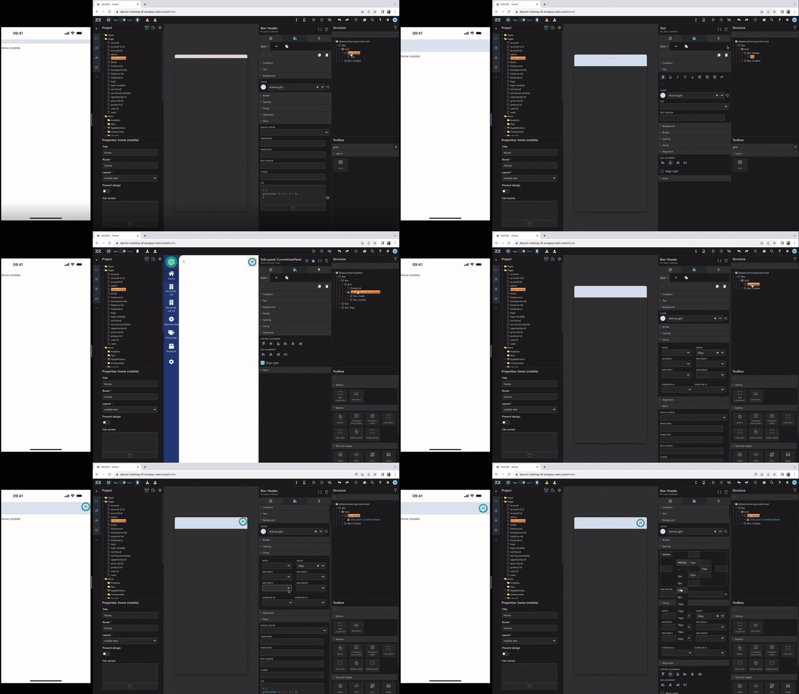
Next, drag and drop a grid component from the toolbox to the top of your page structure. Switch to the grid edit mode to delete a column and change the first row to “min-content”, then drag and drop the Header box in the first row and Content in the second one. Then, close the grid edit mode.
.gif)
Adjust the Header box height to 60px and remove the text component in the header. Then, either build a side panel from the toolbar or copy an exist one from the desktop version of the application, like in this example. To do so, exit mobile mode and right-click on the side panel component, from the structure panel, to “edit -> copy” it. Go back to mobile mode and right-click on the Header box to paste it in. And finally, Horizontal Center Align the Header box and apply a 6px padding on all sides.
4. Copying and Adapting the Side Panel from Desktop to Mobile
The following steps will show you how to create a mobile layout, apply it to an existing mobile page, copy a side panel from a desktop page to a mobile one and adapt it for the Safe Area.
a.From the Project Explorer panel, go to “More” and right-click on the Layout folder. Then, select “add layout”. Type a name for the new layout and save. From the Properties section, activate “in mobile”, then find your home page (mobile) and pick your new layout from the dropdown menu of the same name.
.gif)
b. From the bottom section of the style tab, remove the default CSS from all the components of the page.
.gif)
c. Next, drag and drop a grid component from the toolbox to the top of your page structure. Switch to the grid edit mode to delete a column and change the first row to “min-content”, then drag and drop the Header box in the first row and Content in the second one. Then, close the grid edit mode.
.gif)
d. Adjust the Header box height to 60px and remove the text component in the header. Then, either build a side panel from the toolbar or copy an exist one from the desktop version of the application, like in this example. To do so, exit mobile mode and right-click on the side panel component, from the structure panel, to “edit -> copy” it. Go back to mobile mode and right-click on the Header box to paste it in. And finally, Horizontal Center Align the Header box and apply a 6px padding on all sides.
.gif)
5. Applying the "data-layout-mobile" Class to Custom Pages
This step is like the second step for default pages (p.4) but applied to a custom page. However, because the main box inside a side panel does not accept class names, a few extra steps will be needed to achieve the same result. Start by moving the side panel outside of the Grid. Then, wrap in a vertical box all the boxes inside the first one. Then, simply apply the class name “data-layout-mobile” to that new box
.gif)
6. Adjusting Content Alignment and Item Spacing for Mobile View
Add “2em” of item spacing on the new box and drag the “log out” menu item outside. Select the “checkbox” component and apply “fit content”, then, on the box containing it, apply a Left Self Alignment. Next, pick 100% height for the box containing “my profile” and “users”, as well as for the first box under the “box: inside” one.
.gif)
7. Integrating Theme Color Changes in the Side Panel
As shown on the mobile, a user could easily change the theme to dark, however, at this point, it would only apply the new theme color to the side panel. To rectify the situation, start by dragging the side panel component in the Grid. Then, select the main box, above the Grid, and change its background color for “themeBackground”..gif)
8. Creating and Positioning the Bottom Navigation Menu
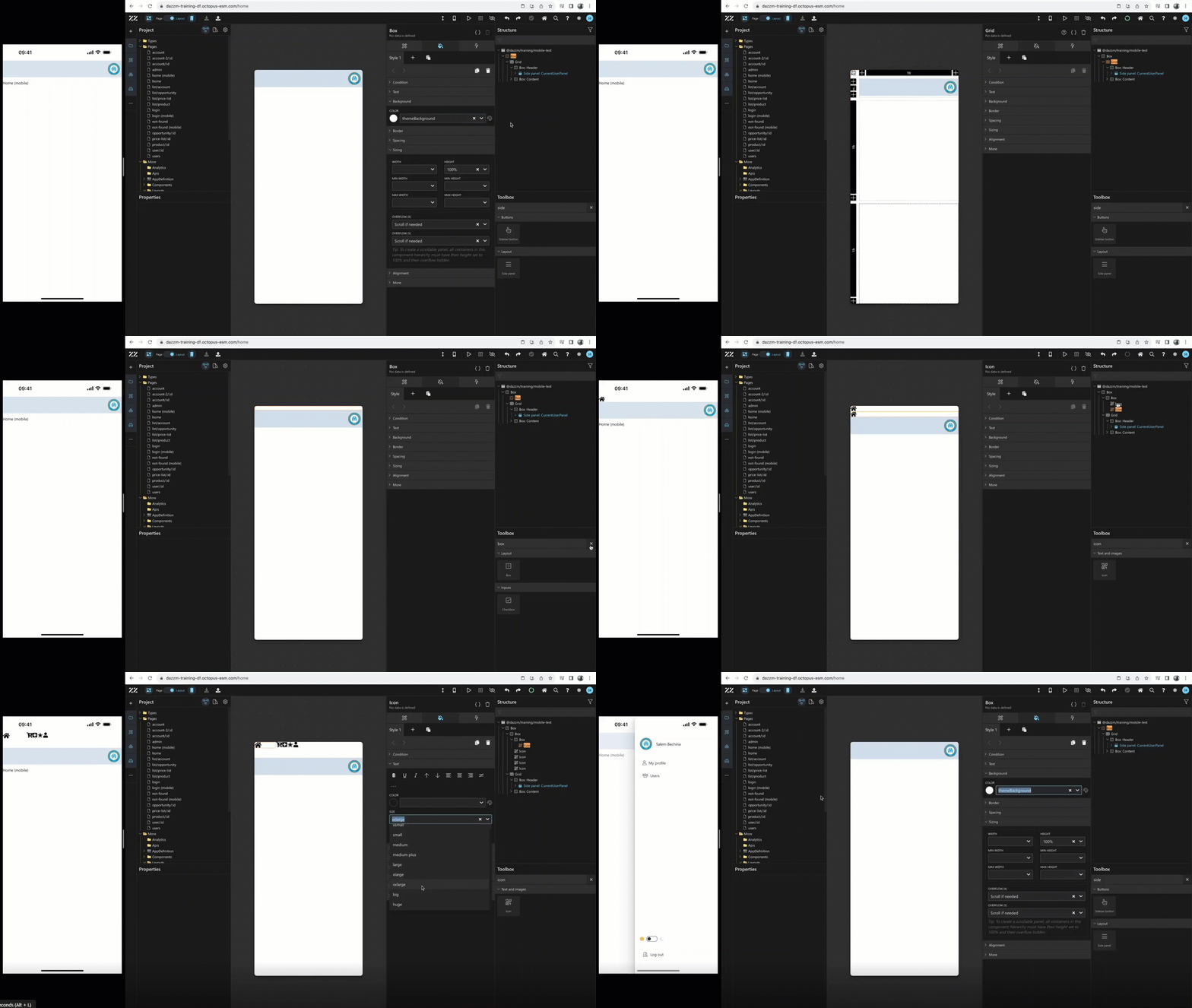
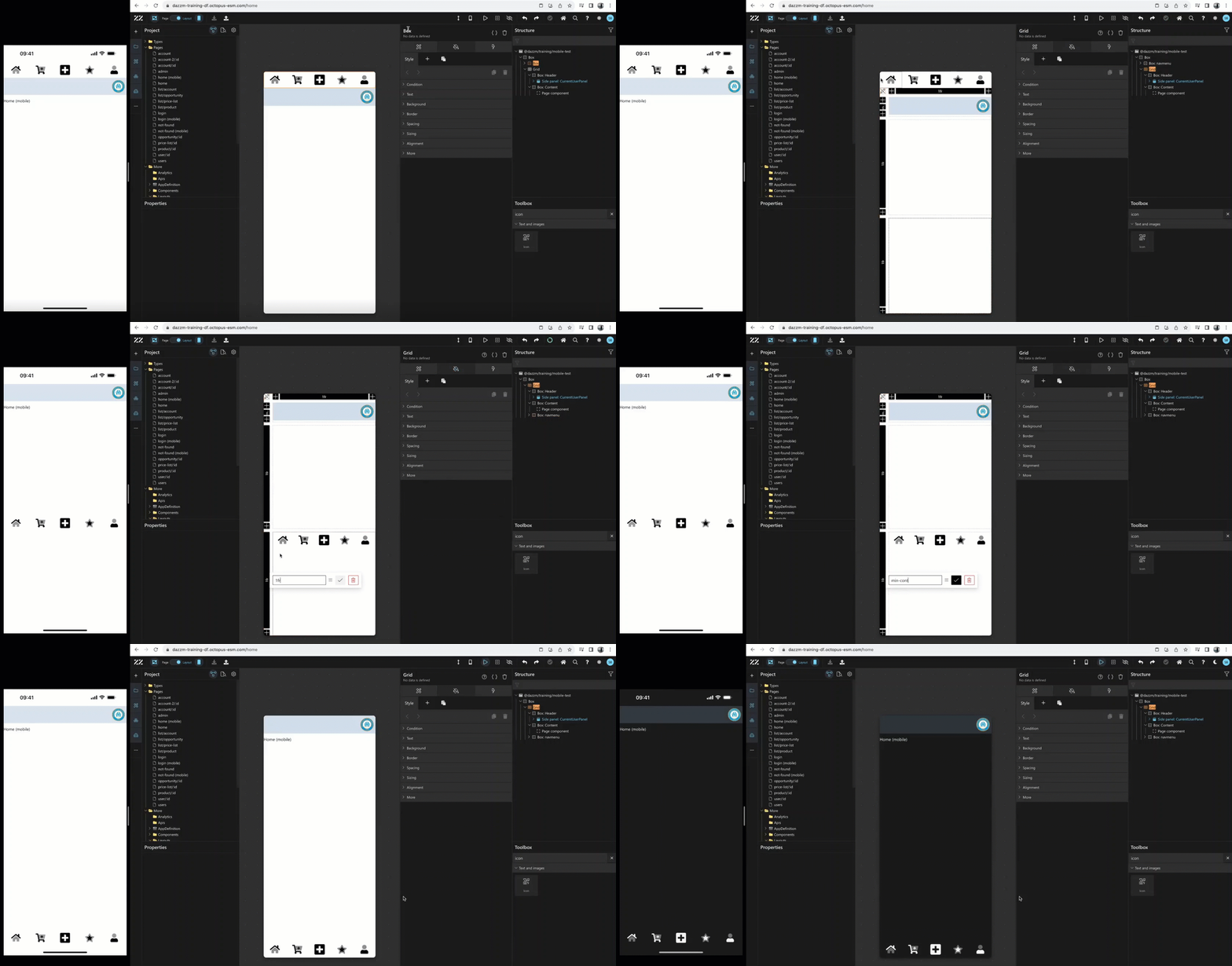
Switch to Grid edit mode, then change the size of the last row to “min-content”. We will use this section to create a bottom icon menu. Then, exit edit mode and add a box, from the toolbar right above the Grid. Next, add an icon component in that box.
From the Attribute tab, change the box’s orientation to horizontal. Right-click on the icon component and add a wrap “box vertical”. To that new box, apply a 20% width and 55px height and change its content alignment to match this image: .
In this example, the icon’s size is changes to “huge” and then, the box containing the icon component is duplicated x4. Finally, icons are selected to match the user’s needs:
To move the navigation menu to the lower end of the screen, go back to Grid edit mode, drag the main box of the menu in the small “min-content” section and exit edit mode. As demonstrated at the end, for a better visibility in both light and dark theme, the icons are in Duotone.
9. Adapting a Page Designed for Desktop to Mobile Layoute
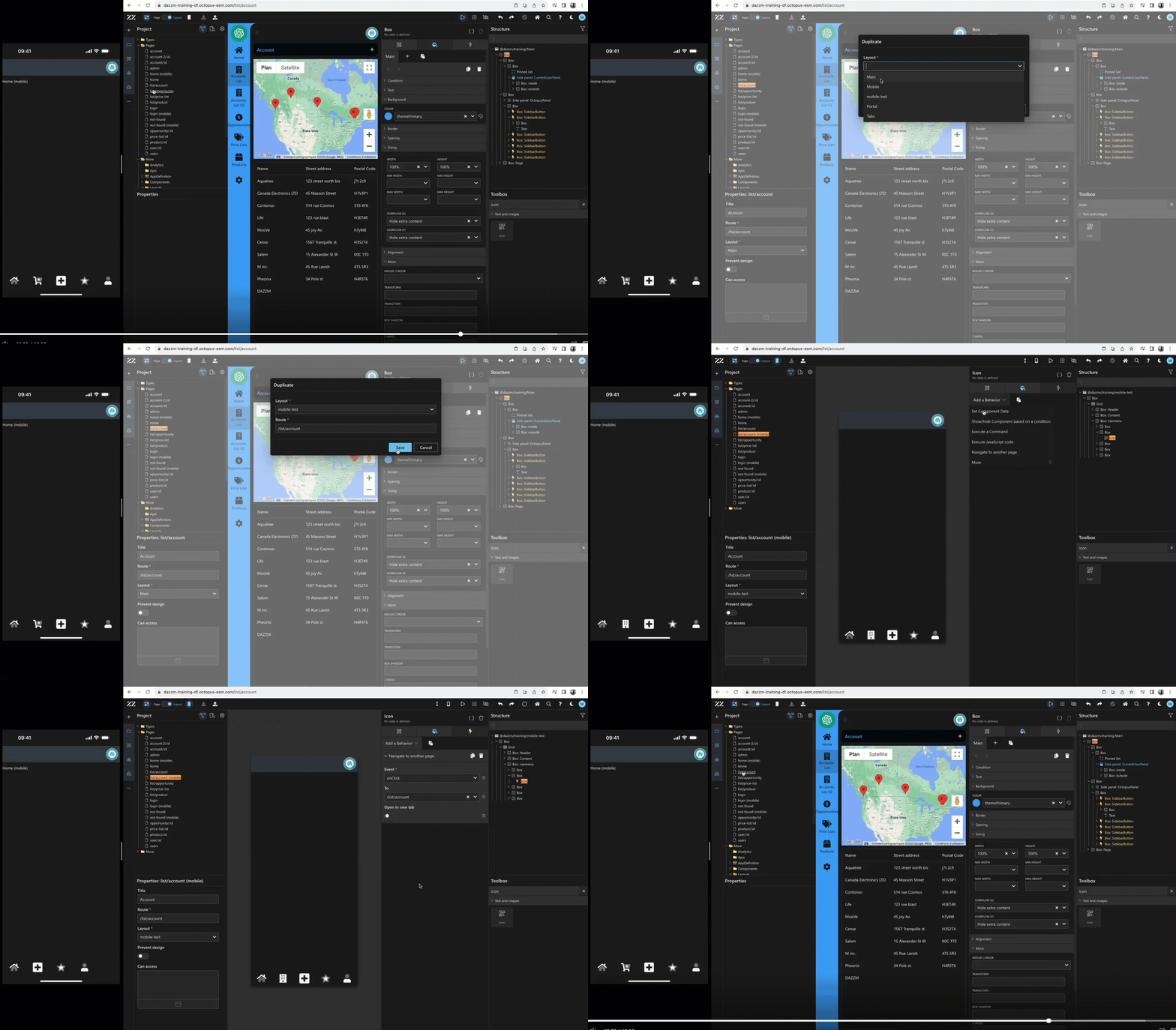
The following step demonstrates how easy it is to take a page designed to fit with the main layout and adapt it to a mobile layout, as well as associate it to our navigation menu. For this example, the account list page with a google map API will be used.
As a first step, duplicate the page and edit its properties to the mobile layout created in step 4.
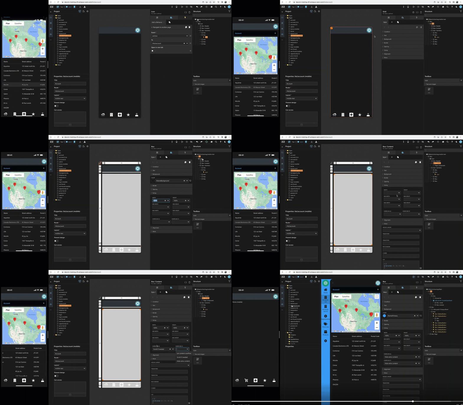
Then, go back to mobile mode and while on layout designer, select the building icon and add a Navigate to Another Page behavior, on Click and link it to /list/account.
10. Implementing Scrolling Behavior for Mobile Page Contenttle
From the Style tab, under the sizing section, remove the “scroll if needed” from the main box in both (X) and (Y). Then, while Grid edit mode is on, put the width of that same box to 100%. Then, select the grid component and add 100% as width and height. Next, select the box content in the grid and add 100% as width and height and finally, add “scroll if needed” to Overflow (X). This should allow a user to scroll in the list without loosing sight of the map, in mobile mode.
Conclusion
By setting up a mobile layout with side panels and a bottom navigation menu, users can ensure a better mobile experience that respects safe areas and provides a responsive design. This guide walks through transforming a desktop-focused design into an efficient, user-friendly mobile layout, improving accessibility and usability for mobile users.