Changelog
Log changes made by solution developer and platform updates (if option is activated).
.png)
.png)
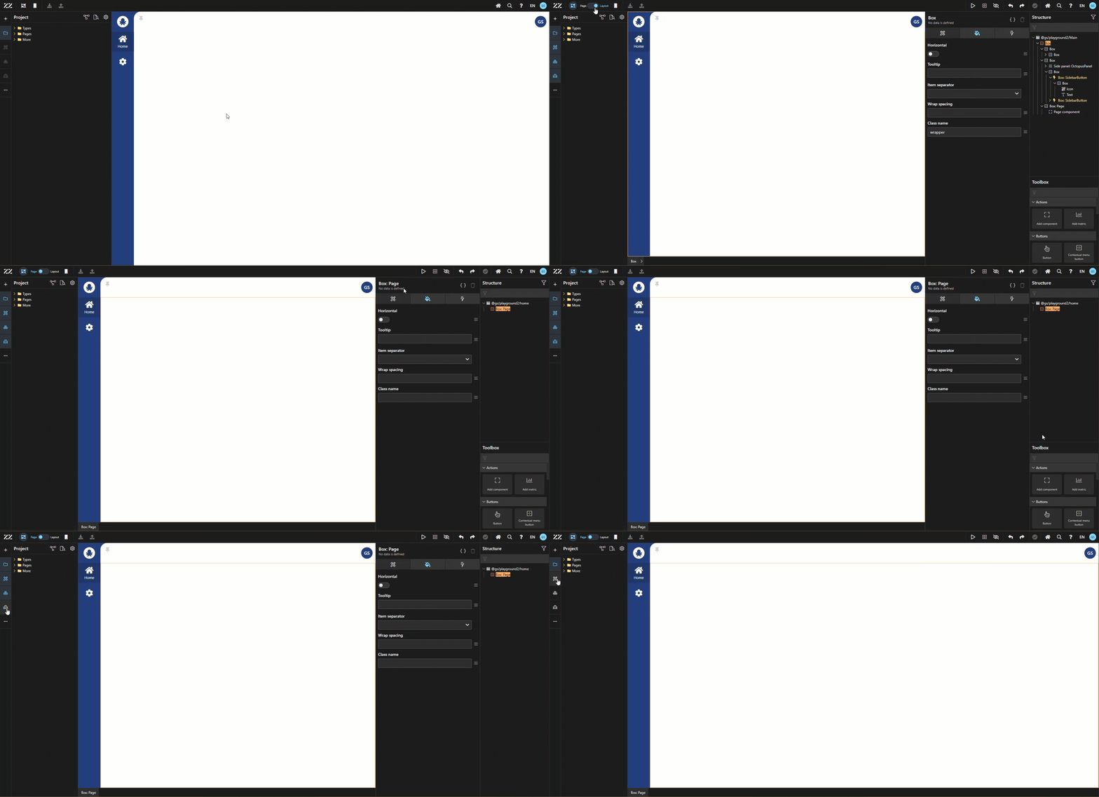
Designer Mode .png) What is the difference between Page and Layout Designer?
What is the difference between Page and Layout Designer?
Page Designer allows the user to modify any UI aspect of the content of the pages.
Layout Designer allows to apply changes to the application panels; which are fix menus.
The default application template had a menu panel on the lefthand side, as well as the top, but the applications created using the no code DAZZM platform can have panels on any four sides. The platform also has drawer menus, that open from either side. These are especially useful when creating a mobile or tablet app.
While using any of the 2 “designer” mode on, any panels can be activated/closed: Component, Structure and Toolbox. However, the “Project Explorer” panel can be opened/closed even when “designer” is turned off.
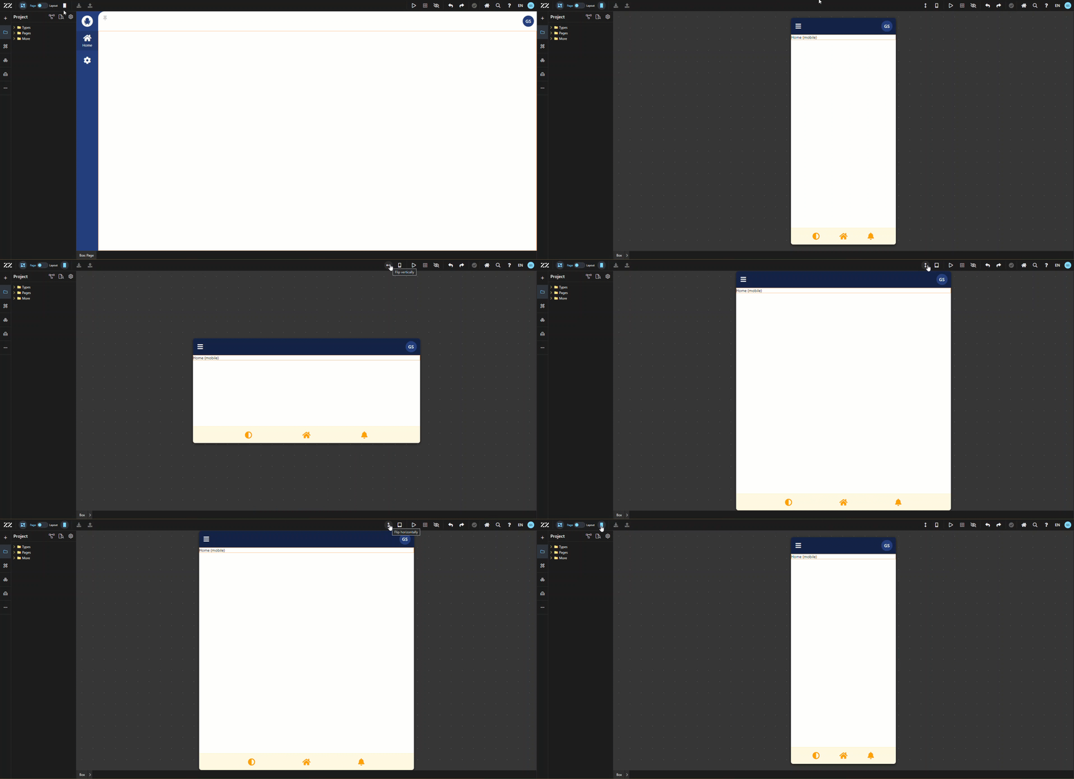
Mobile / Tablet Mode .png)
This platform allows its users to design mobile and tablet apps as well and flip the view from a horizontal and vertical standpoint.
N.B: You need to activate mobile mode to see the “tablet mode” option.
Platform Update .png)
This icon turns yellow when an update is available. It can be for a platform update of an application update, or both at the same time. Keep in mind that, before doing an update, it is highly recommended to look at the changelog. This will help in understanding what to test in the application after pushing the update.
The user can choose to display or not the platform update in the Changelog using the switch, at the bottom of the dialog.
Publishing .png)
See video 1.3
Preview Mode .png)
Allows the user to test the application without leaving the platform, making it easy to go back and forth between testing and applying changes.
N.B: It’s only visible with Designer mode
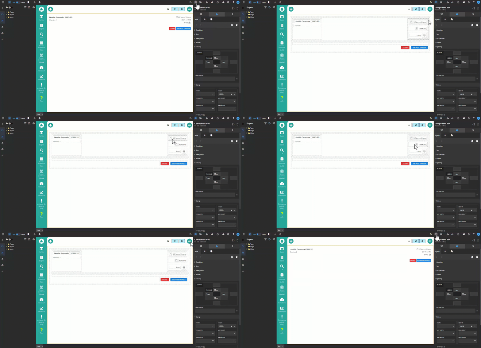
Wireframe Mode .png)
This mode is especially useful when needing to move or add a component in a section that already has many components.
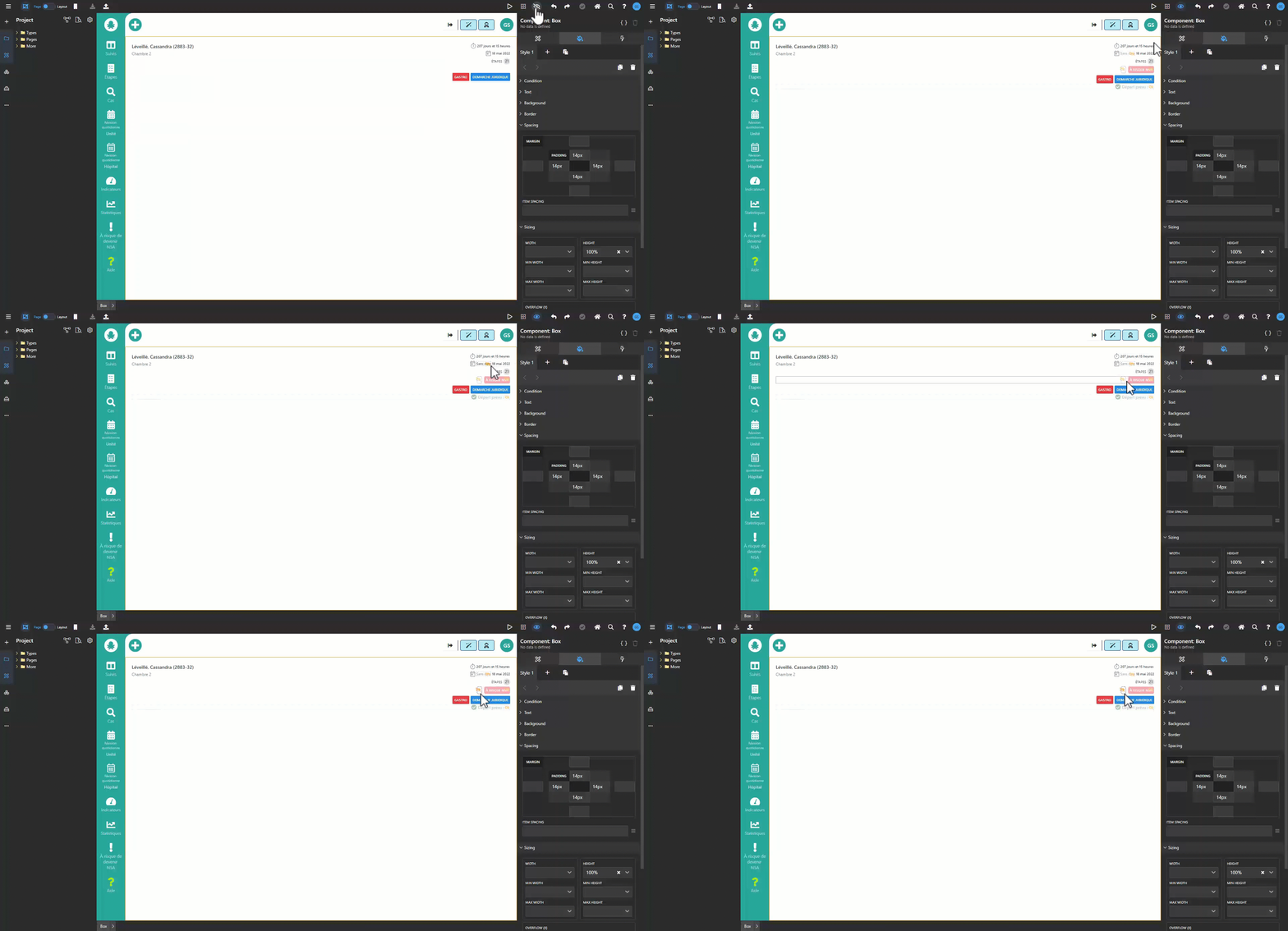
Visibility Mode .png)
This mode displays elements that could be visible in that page, according to a user’s selection, but are currently hidden.
Undo/Reapply .png)
Allows the user to revert a change or reapply it. The green checkmark next to the two arrows indicates that the change that was just made was automatically saved by the system.
N.B: It only affects UI changes that are not yet published on your page, and it won’t affect changes made to the “project explorer panel”.
Home Page .png)
Eventually, the user will be able to configure and define their own home page.
Search .png)
Do a low-level keyword search in the application’s definition and metadata.
Report a problem .png)
Request a new feature by clicking “a feature is missing”, ask a question or report something malfunctioning*.
N.B: Our system will automatically log any messages displayed in a red ribbon, so there is no need to report it.
.png)
User Icon
Eventually, the user will be able to set their own preferences by clicking on the user icon, such as their default IDE language or preferred panel configuration.
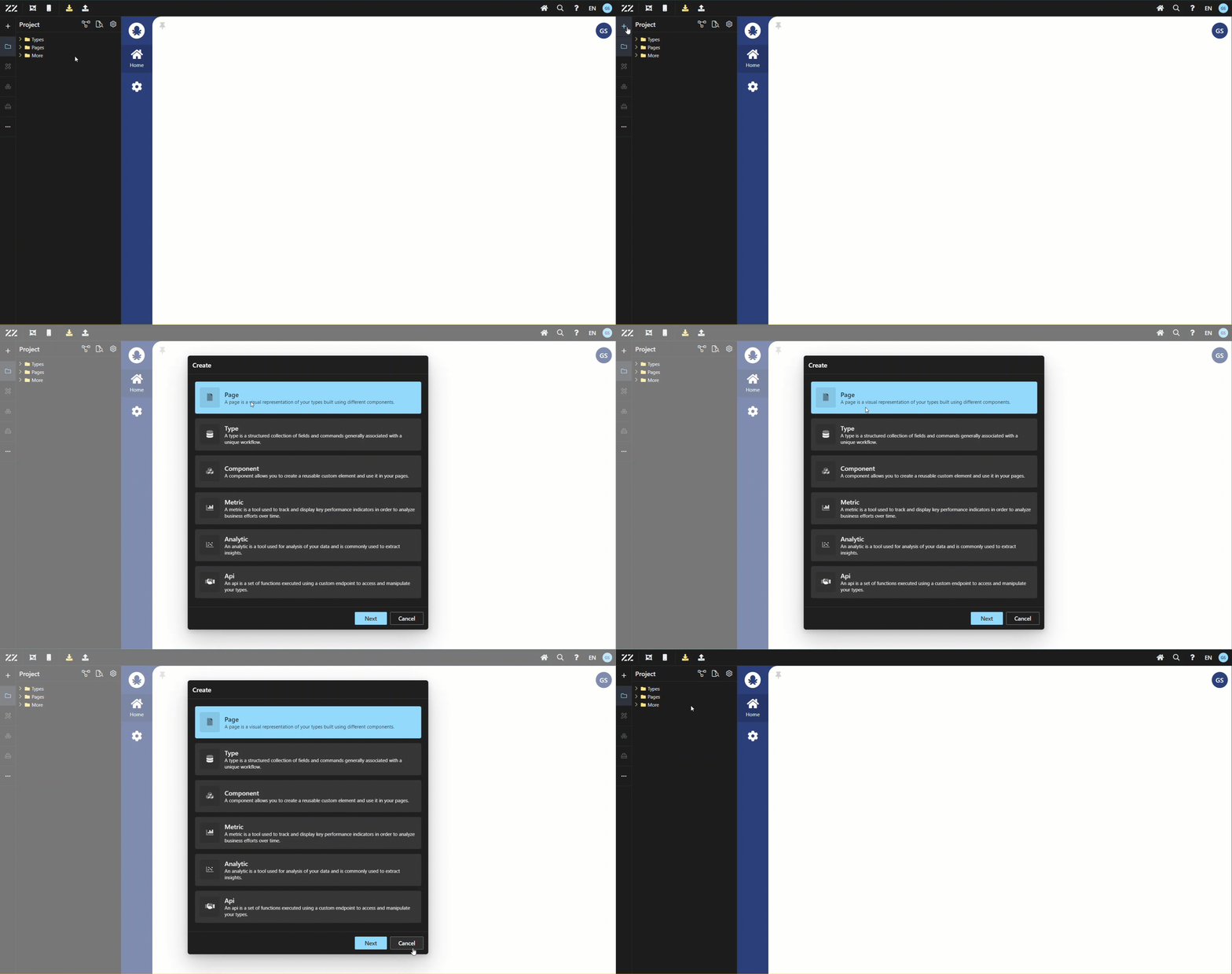
Create .png)
Allows the user to create pages, types*, components, etc…
*Types are also known as “aggregate” in our system.
Project Explorer Panel .png)
Panel where you create the data modelling.
Under the “types” folder, each aggregate has subfolders for its fields and commands.
When creating a new page, right-click on the “pages” folder. The user can also navigate to static pages, in other words: pages that don't contain dynamic keys.
N.B: Dynamic keys are variables in routes that start with /: , and they usually support unique values like ids.
Properties .png)
Gives access to modify the properties of the element of the application selected. Naturally, the fields available will vary according to the type of element selected.
Go To Definition .png)
Allows to search for a field within the data structure, using the value of that field. By clicking on a result, it will highlight it in the data structure of the project explorer.
Project Configuration .png)
Gives different organizational options for the project’s data model:
.png)
Component Panel .png)
It gives access to a panel of a selected component's characteristics. It’s divided into 3 tabs: Attribute, Style and Behavior.
Attribute .png)
Lists the component’s attributes and properties according to the component selected in the application's UI.
Style .png)
This tab has many sections: Text, background, Border, spacing, etc.
Behavior .png)
From this tab, the user can define the data of the component, set a visibility condition, or apply an action to a click, etc.
Structure Panel .png)
Displays a tree structure of the current page’s components. It’s like the breadcrumb section, but with the difference that this one focuses on a selected component.
Toolbox Panel .png)
Offers a variety of visual and structural elements used to build a page. The most commonly used ones are text, button, icon and box. After a user has created reusable components, they will be able to find them in the toolbox as well.
N.B: All 4 of these panels can be opened or closed and resized to the user’s liking, to help give the user a customized experience.
Theme Editor
Allows the user to change colors throughout the application, on all pages, all at once. This should be anyone’s go to, when needing to apply color changes.
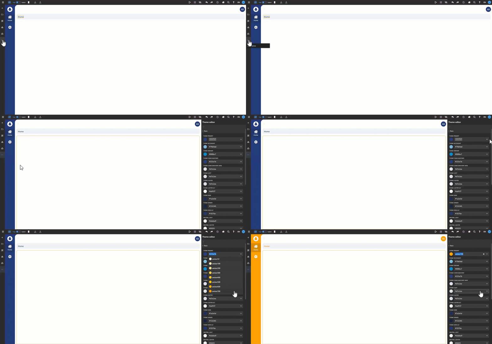
*Keep in mind that it won’t affect any color changes made from the style tab.
This method should be used to capture the viewer’s attention and apply permanent change..png)