Create and add a ReactJS component to the toolbox
Updated on Published on
Article summary
In modern ReactJS development, creating reusable components and adding them to a design framework is important for improving productivity and keeping code consistent. Create a custom ReactJS component and make it available in the toolbox. You will learn how to organize and set up the component so that it is easy to access and configure through the platform’s user interface.
Step-by-step instructions
Section titled “Step-by-step instructions”1. Create the component
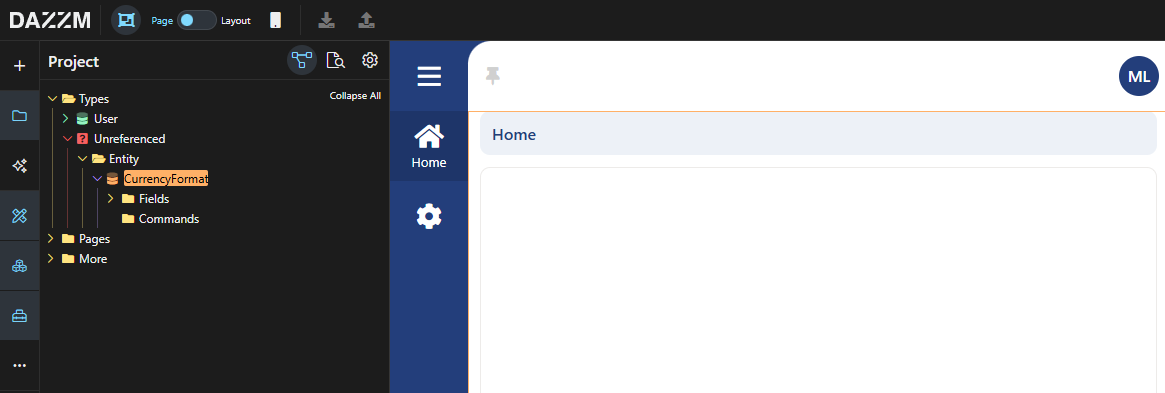
Section titled “1. Create the component”ReactJS components are unreferenced entities, therefore we need to create an Entity.
-
Perform a right-click on any Aggregate within your Project explorer.
-
Select Add entity.
-
Decide on a name for your component. In this case, we will call it “CurrencyFormat”.
-
Press “Save”.
Your Entity will be listed in the “Unreferenced” section of your Project explorer.
2. Add the component to the toolbox
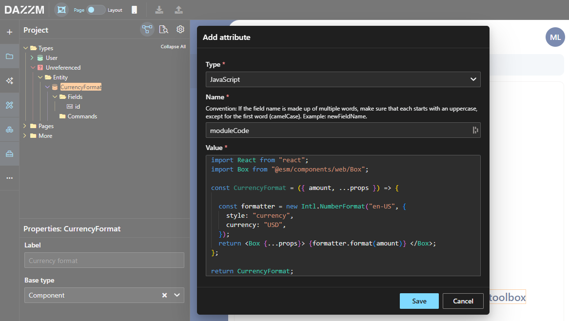
Section titled “2. Add the component to the toolbox”Now that the entity for our component has been established, we must include the correct type and attributes so that it is identified as a Component.
-
Select your entity to display its properties in the “Properties” panel.
-
Choose “Component” in the “Base type” field.
-
Right-click on your entity, then under “More”, select “Add attribute”.
-
Set the type of this attribute to “JavaScript”.
-
Enter “moduleCode” as the name for the attribute.
-
Insert the ReactJS code of your component as the value for the attribute.
-
Press “Save”.
import React from "react";import Box from "@esm/components/web/Box";
const CurrencyFormat = ({ amount, ...props }) => {
  const formatter = new Intl.NumberFormat("en-US", {    style: "currency",    currency: "USD",  });  return <Box {...props}> {formatter.format(amount)} </Box>;};
return CurrencyFormat;
To ensure your component aligns with the current styling framework, you need to utilize a “Box” as the primary element (instead of a “div”). Additionally, you should accept props (…props) and forward them to Box, since the platform relies on props to transmit a significant amount of information across components.
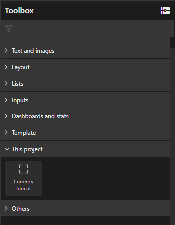
Your component is now accessible in the Toolbox, located in the “This project” category.
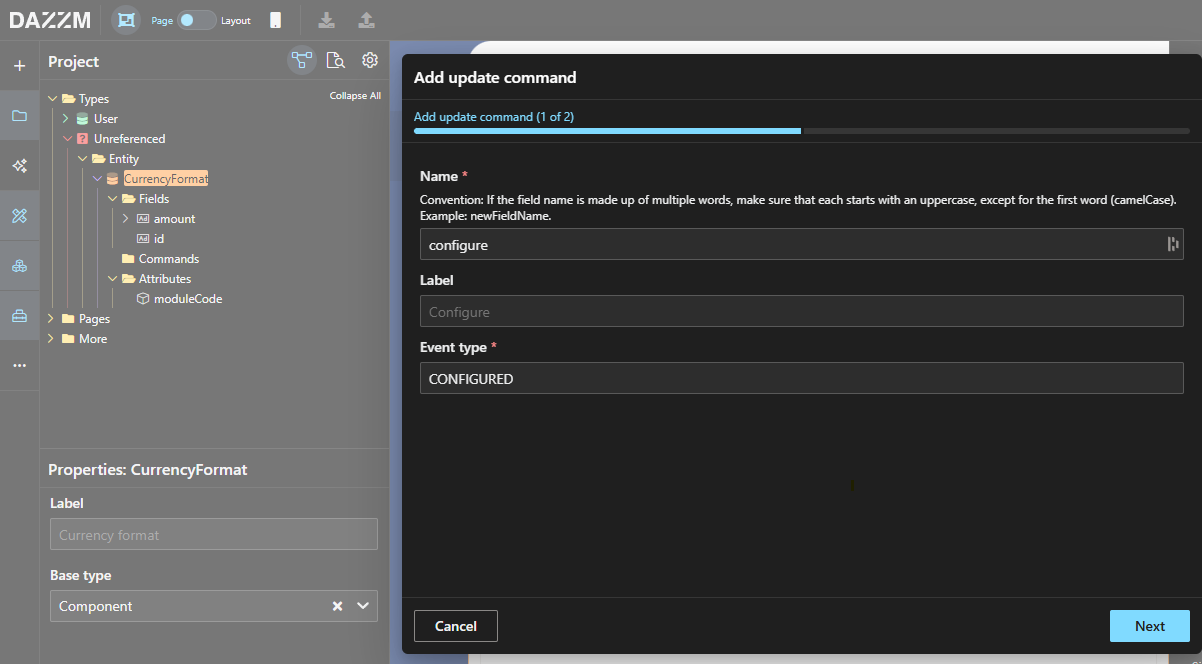
3. Configure the component
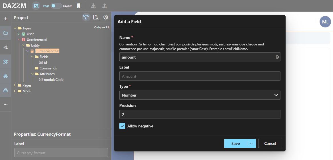
Section titled “3. Configure the component”Now that our component has been established and is available, we must set up the entity to allow us to send parameters to the component within the UI.
-
Perform a right-click on the Fields folder within the entity (or right-click on the entity itself) and select “Add field”.
-
In this instance, the anticipated Parameter is “amount”, categorized as “Number”. Thus, we will include this field as our only parameter.
-
Right-click the “Commands” folder in the entity (or right-click the entity itself) and choose “Add update command”.
-
Enter “configure” for the command name and “CONFIGURED” for the command event.
-
Click “Next” and incorporate your field as a parameter, then click “Save”.
The component will now operate just like any other native component within the platform.
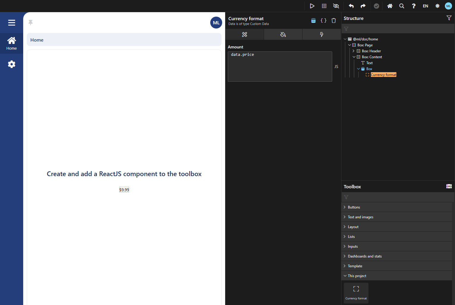
4. Use the component
Section titled “4. Use the component”Now that everything is configured correctly, the component is prepared for use in our application.
-
From the toolbox section, drag and place the component into the UI.
-
Click on the “Attributes” tab within the component’s panel.
-
To set a dynamic field value, modify the input type to “Javascript”. In this instance, we will utilize “data.price” as our value for the amount.
The component is now showing our amount, presented in a currency format.
Conclusion
Section titled “Conclusion”You have effectively developed and set up a reusable React component for formatting currency, incorporating it into the platform’s toolkit with complete configurability. This component is now available for use across various pages, guaranteeing a uniform currency presentation throughout the application. For enhancements in the future, think about introducing more custom components or broadening functionality with extra React props to improve the modularity of the UI.