Display/Hide an Element When Hovering: Edit Button
Updated on Published on
Article summary
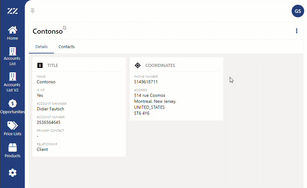
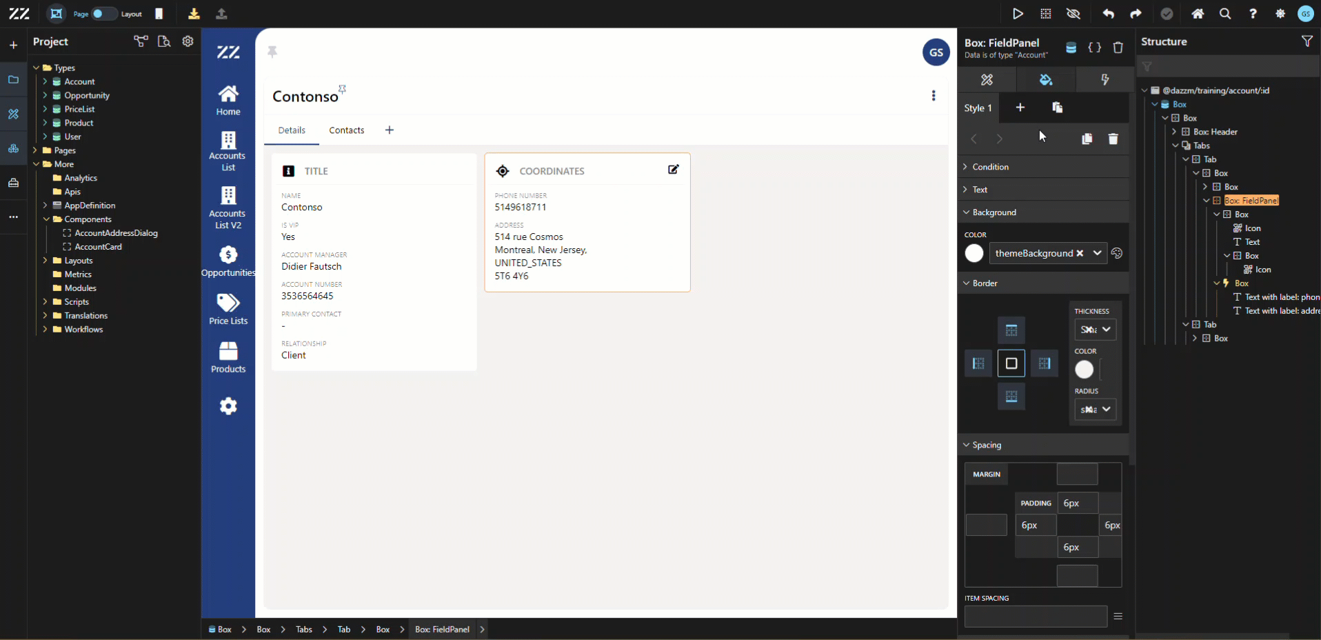
Learn how to display/hide an element when the mouse hovers over a predetermined section. In this example, an “edit” icon will be displayed when hovering over the “coordinates” section of the account’s detail page. 1. Adding the Edit Icon to the Field Panel Drag and drop an icon, next to the box containing the title of the field panel and wrap it in a box. It’s essential to apply a wrap to the icon that will be displayed only when hovering on a specific section, because only a box gives access to “class name”…
In this example, an “edit” icon will be displayed when hovering over the “coordinates” section of the account’s detail page.
Step-by-step instructions
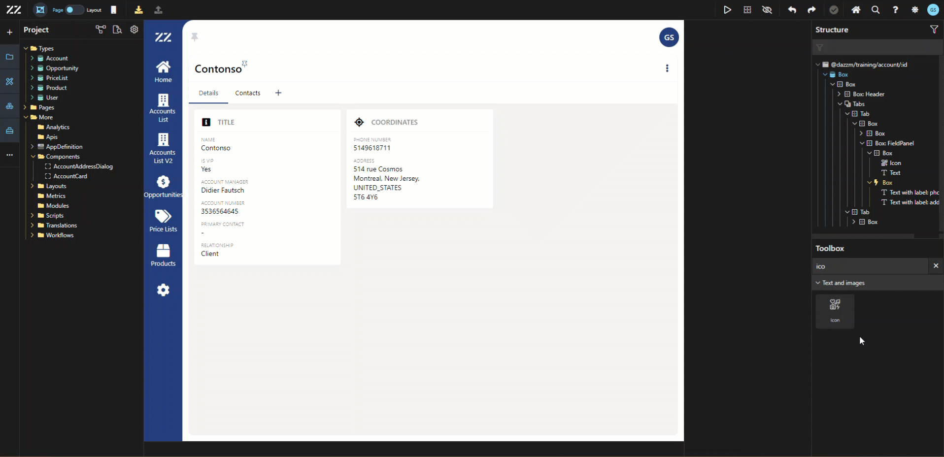
Section titled “Step-by-step instructions”1. Adding the Edit Icon to the Field Panel
Section titled “1. Adding the Edit Icon to the Field Panel”Drag and drop an icon, next to the box containing the title of the field panel and wrap it in a box. It’s essential to apply a wrap to the icon that will be displayed only when hovering on a specific section, because only a box gives access to “class name” in the attribute tab. In this example, “hovertarger” was used as our class name, but any name can be used.
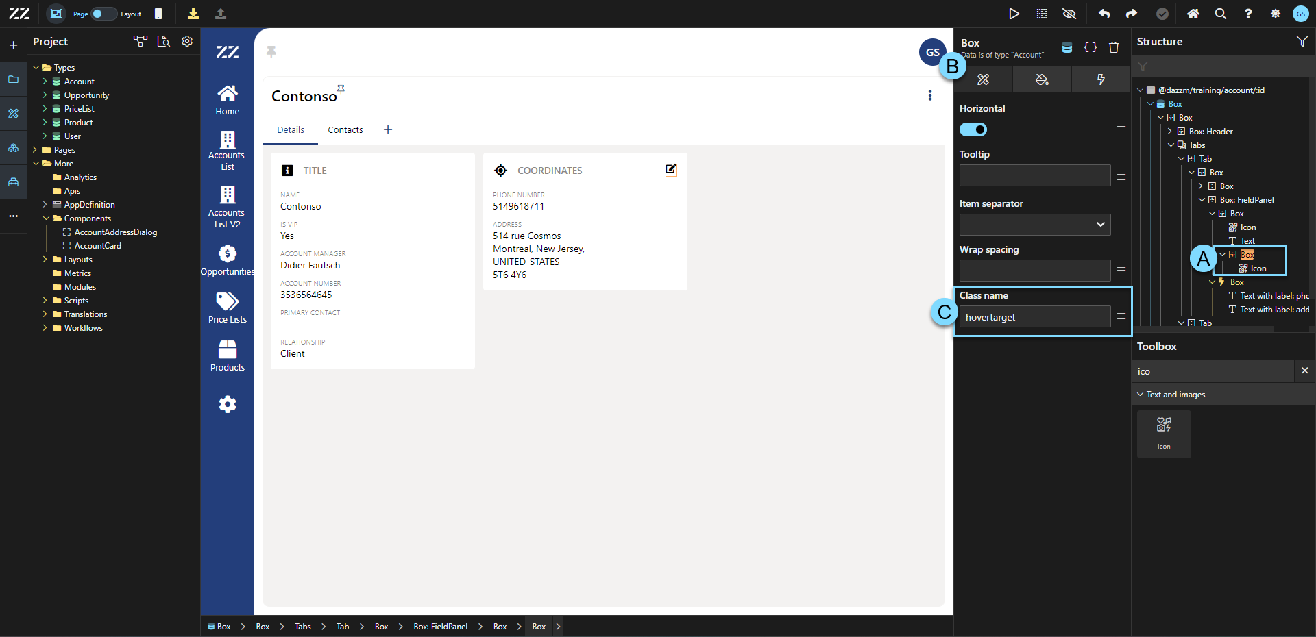
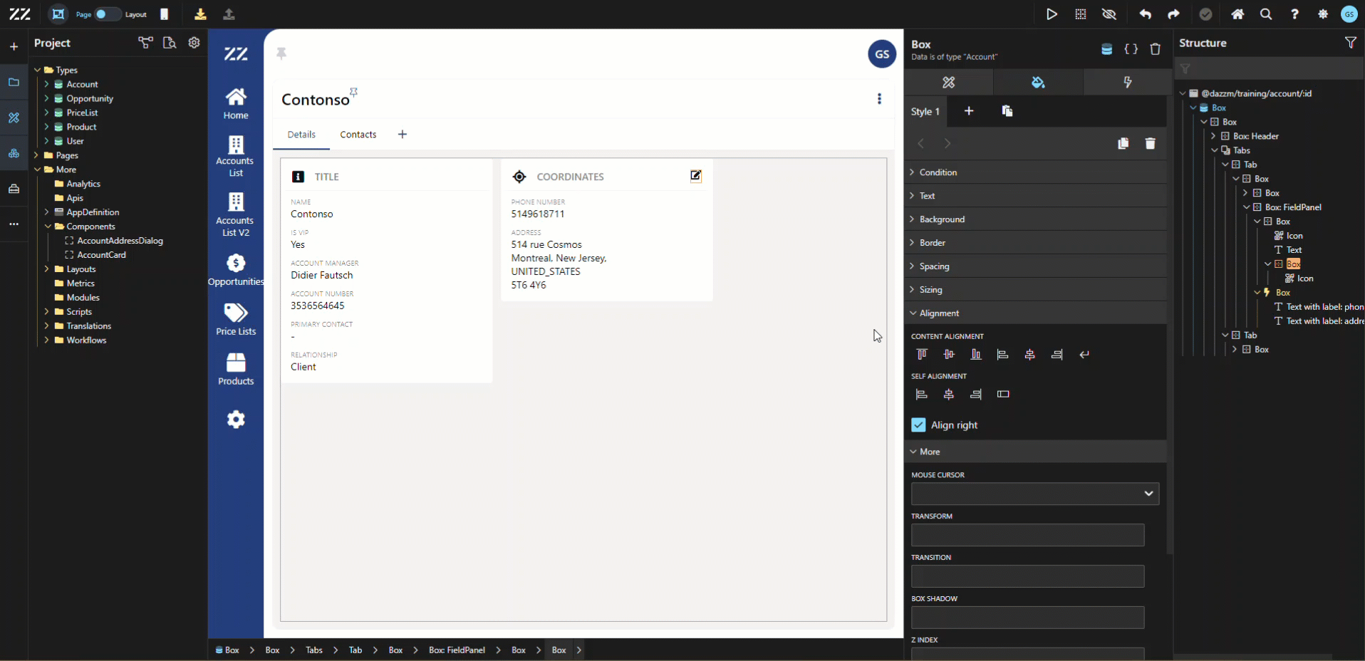
2. Hiding the Icon Before Hover
Section titled “2. Hiding the Icon Before Hover”To hide the icon before the mouse hovers over a selected section, add this line of code in the CSS section of the box around the icon:
opacity:0;From that point, the icon is no longer visible.
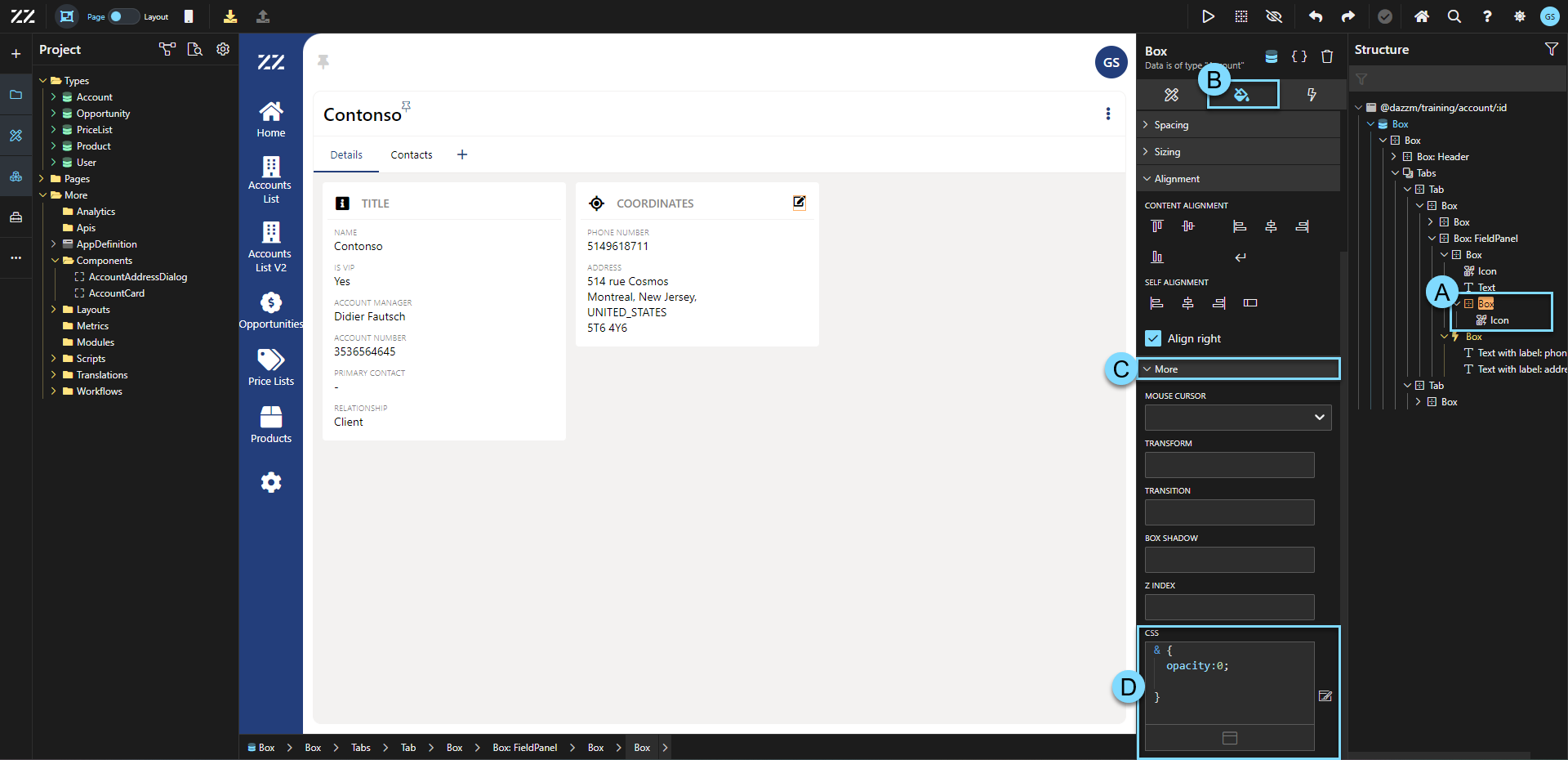
3.Displaying the Icon on Hover with CSS
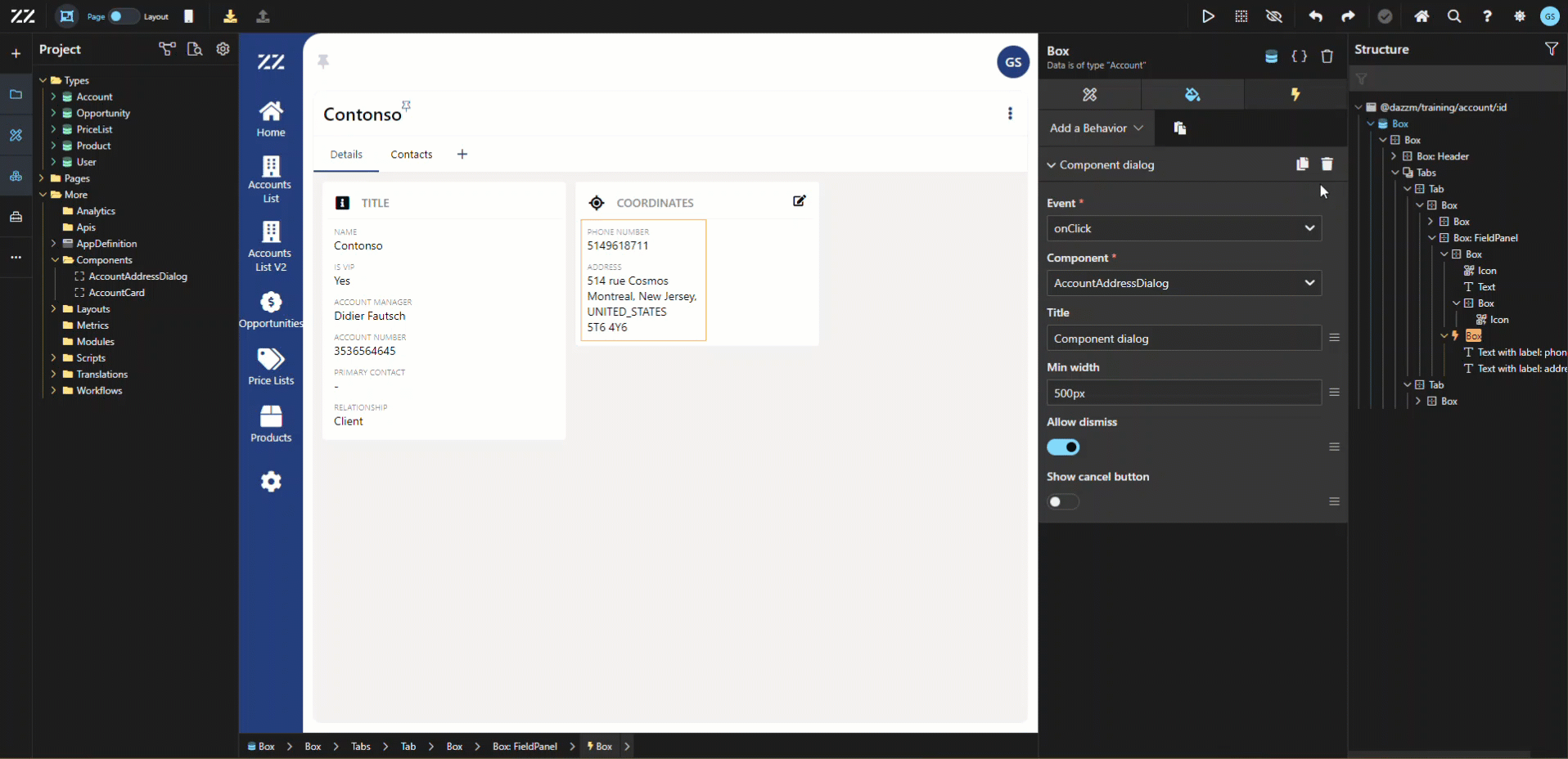
Section titled “3.Displaying the Icon on Hover with CSS”3. Then, select the element that will activate the display of the icon when hovering over. In this example, the fieldpanel was used. Add a second style tab, to which you apply a state “hover” and this line of CSS code:
& {.hovertarget { opacity: 1 !important; }}This will allow the icon to be displayed once you hover over the fieldpanel.
*Be sur to match the classname entered in step 1 in this code.
**By adding “important” in the code, you push this value above any other.
4. Smoothing the Hover Transition
Section titled “4. Smoothing the Hover Transition”To make the transition smoother between the icon being displayed or not, add “opacity 0.3s ease-in” to the transition section of the box containing the icon:
5. Assigning the Edit Command to the Icon
Section titled “5. Assigning the Edit Command to the Icon”As a last step, of course, move the behavior that triggers the edit command to the icon:
Conclusion
Section titled “Conclusion”Using hover effects to display or hide elements, like an edit button, enhances the user interface by keeping the design clean and interactive. Applying simple CSS rules ensures a smooth transition and provides a better user experience by revealing actionable items only when needed.