Creating a Custom Dialog with an Embedded Form
Updated on Published on
Article summary
The component dialog behavior lets a user display a reusable component with an embedded form instead of a standard dialog. This creates the possibility to save space between fields and customize the look of the dialog. 1. Creating the Reusable Component for the Dialog Create the reusable component (AccountAddressDialog) which will be used as our dialog and set the data source to account:
Step-by-step instructions
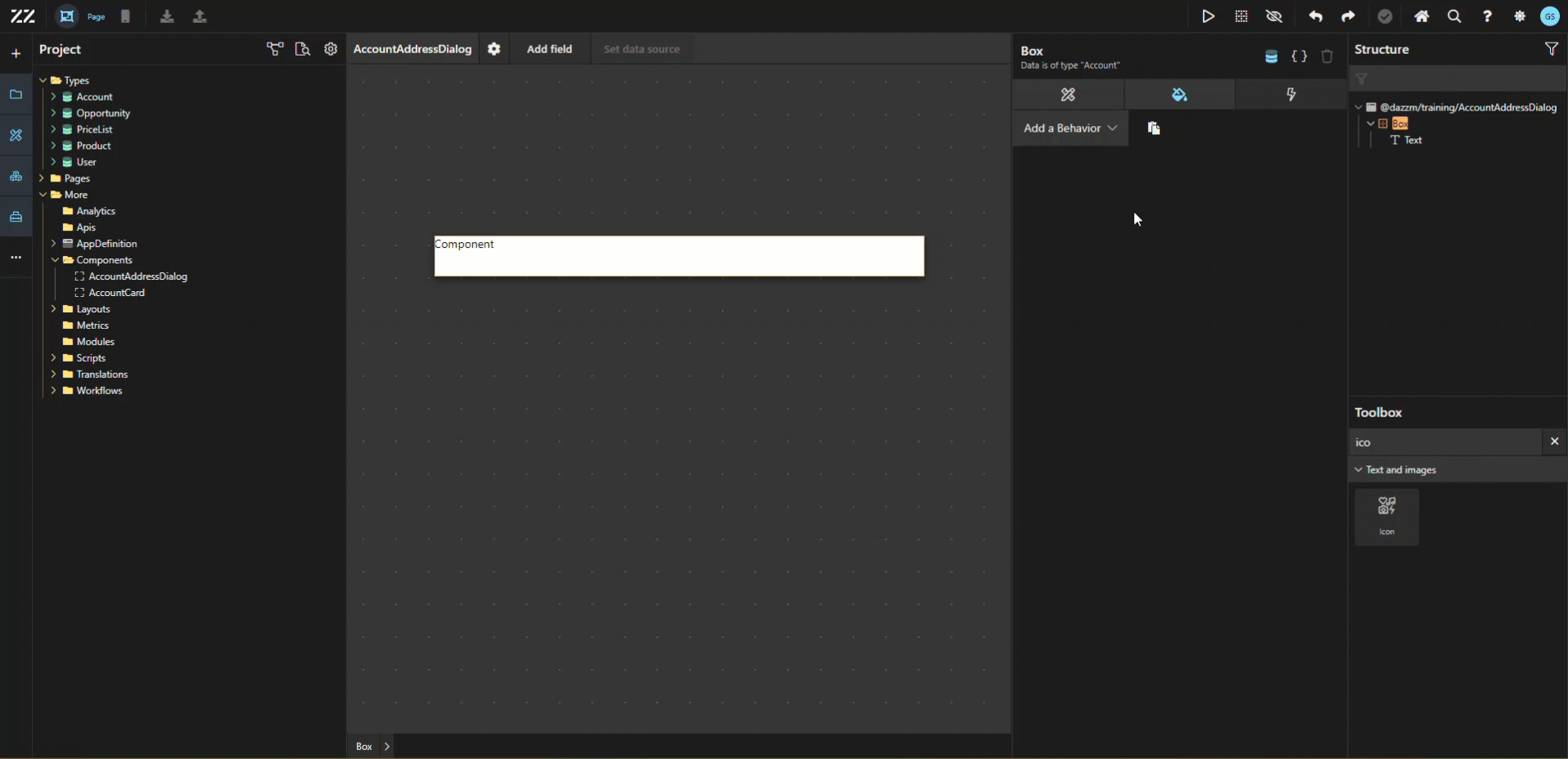
Section titled “Step-by-step instructions”1. Creating the Reusable Component for the Dialog
Section titled “1. Creating the Reusable Component for the Dialog”Create the reusable component (AccountAddressDialog) which will be used as our dialog and set the data source to account:
db.Account.all.first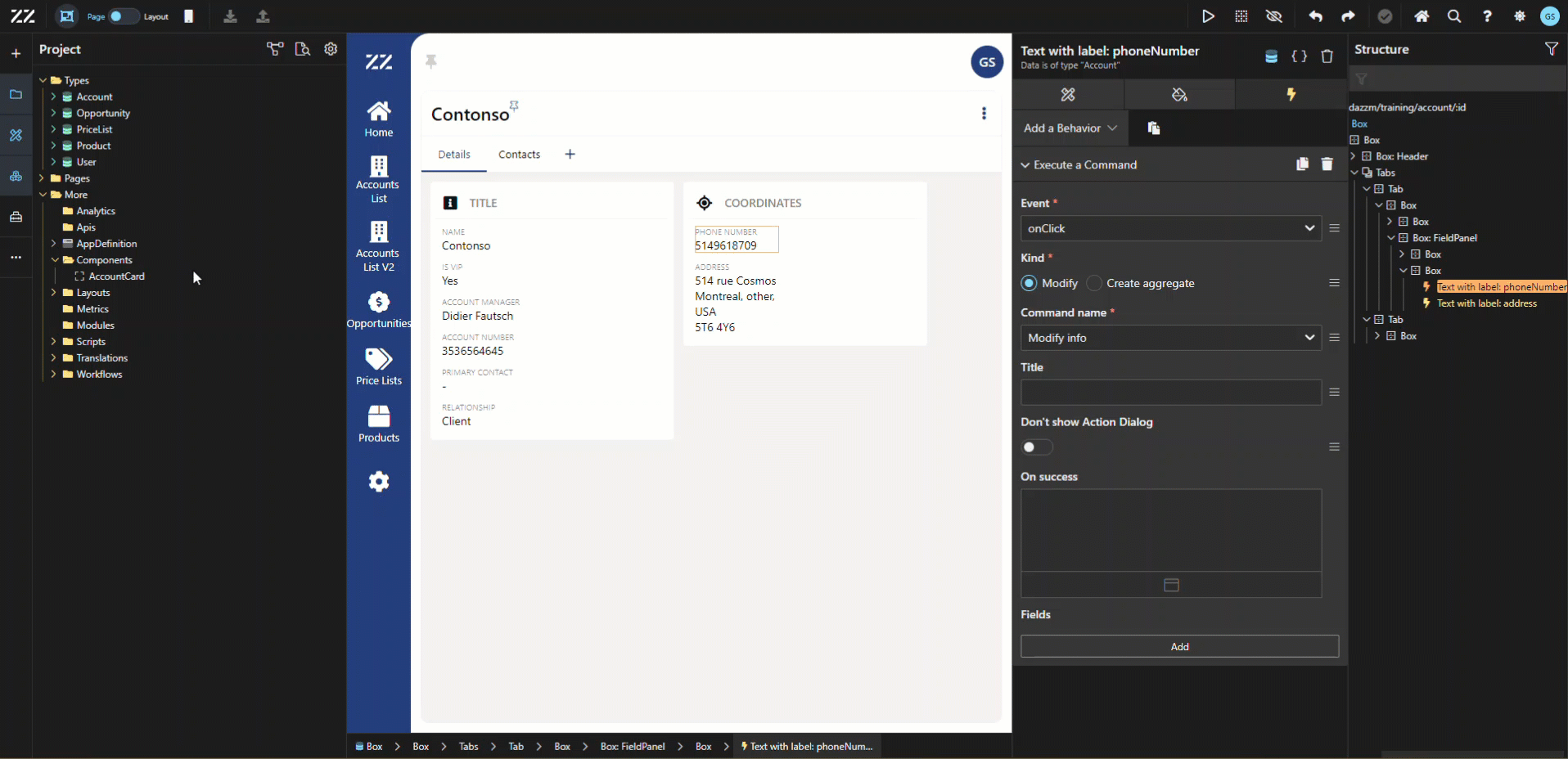
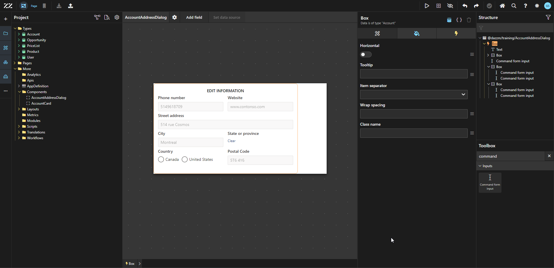
2. Adding Command Form Behavior to the Dialog Component
Section titled “2. Adding Command Form Behavior to the Dialog Component”To be able to use this reusable component as a dialog later, add a Command Form behavior to the main box and link it to the appropriate command. In this example, we are using the “modify info” one, which has all the address fields for accounts as params.
3. Embedding Input Fields into the Form
Section titled “3. Embedding Input Fields into the Form”Drag and drop a “command form input” from the toolbox under the text placeholder. From the attribute tab, select the field needed. Repeat this process until all fields have been added. In this example, we added phone number, website, street address, city, state, country and postal code.
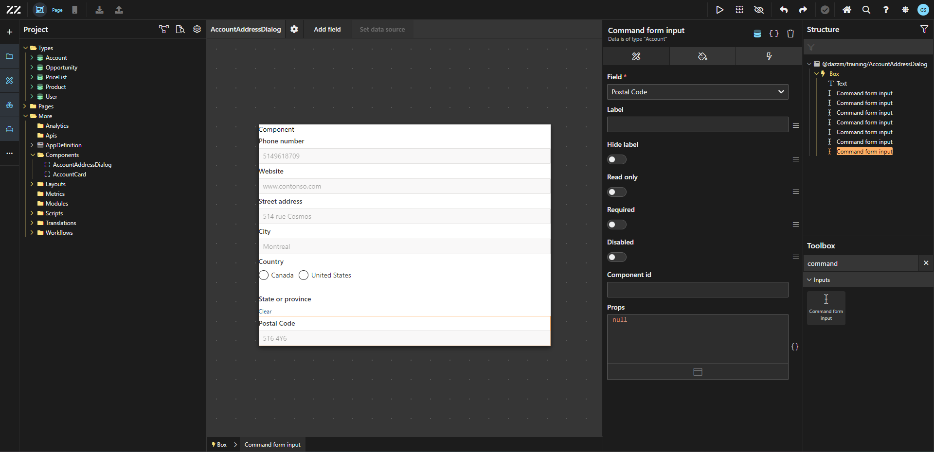
Use horizontal wrap, item spacing and spacing to organize those fields in the space.
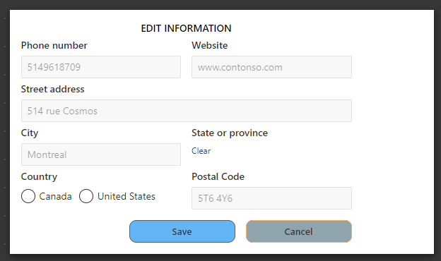
4. Adding Save and Cancel Buttons to the Form
Section titled “4. Adding Save and Cancel Buttons to the Form”To allow end users to submit the form, add a button with “save” as label.
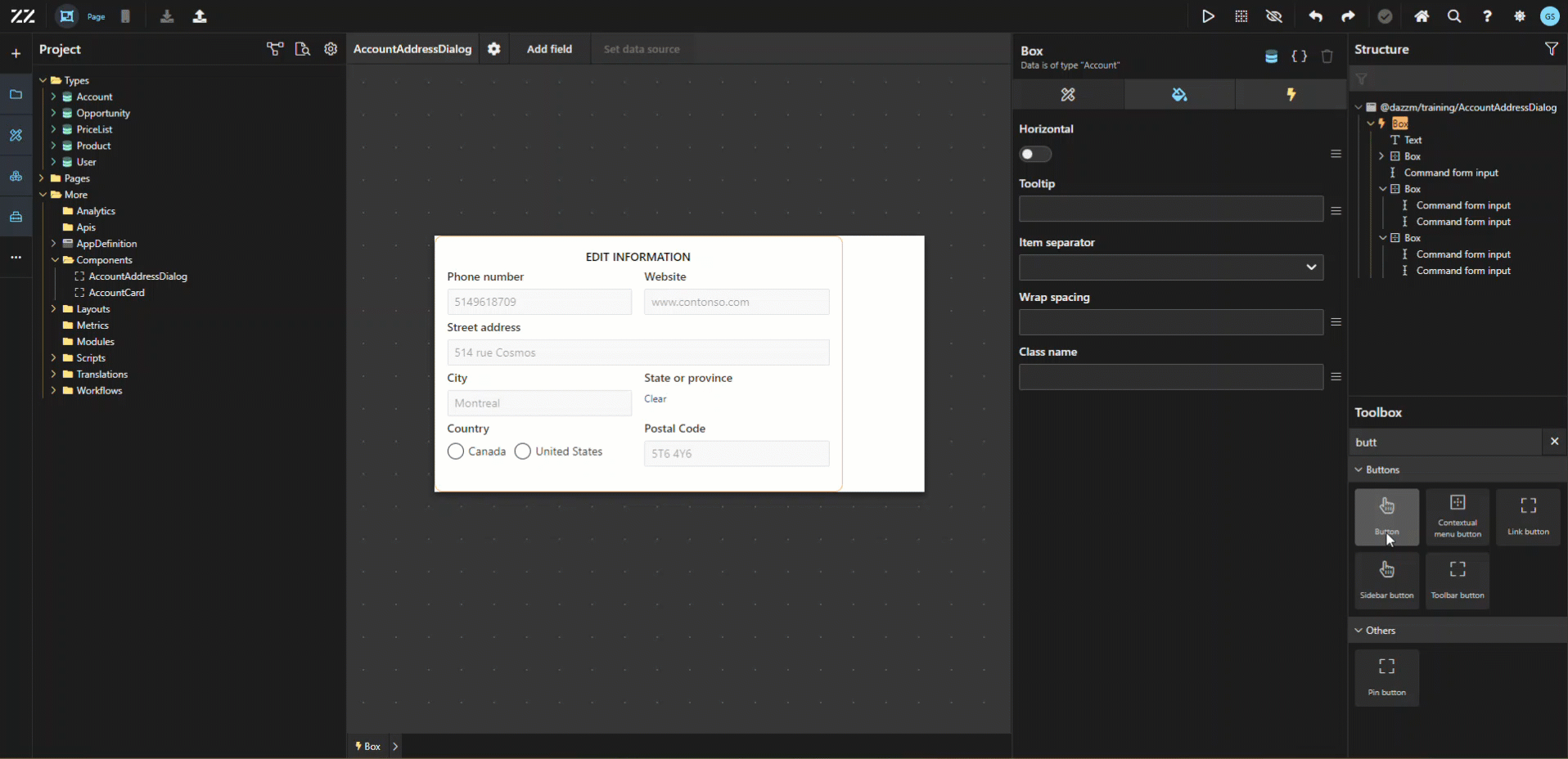
Repeat step 4 to add a “cancel” option and add some styling to both.
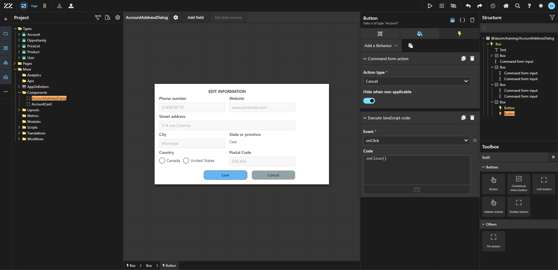
5. Implementing JavaScript to Automatically Close the Dialog
Section titled “5. Implementing JavaScript to Automatically Close the Dialog”On the “save” button, add a “execute JavaScript code” behavior, onClick with this line of code:
onClose()This will make the dialog automatically closes after the end user clicks “save”.
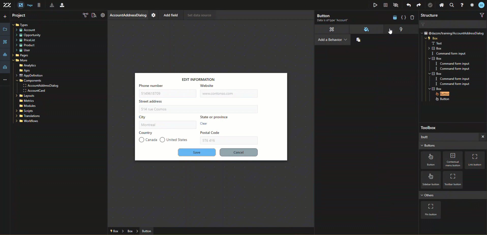
Then, add a “command form action” behavior with the action type set to “submit” and “hide when non applicable”.

Repeat step 6 for the “cancel” button, with the action type set to “cancel” instead.
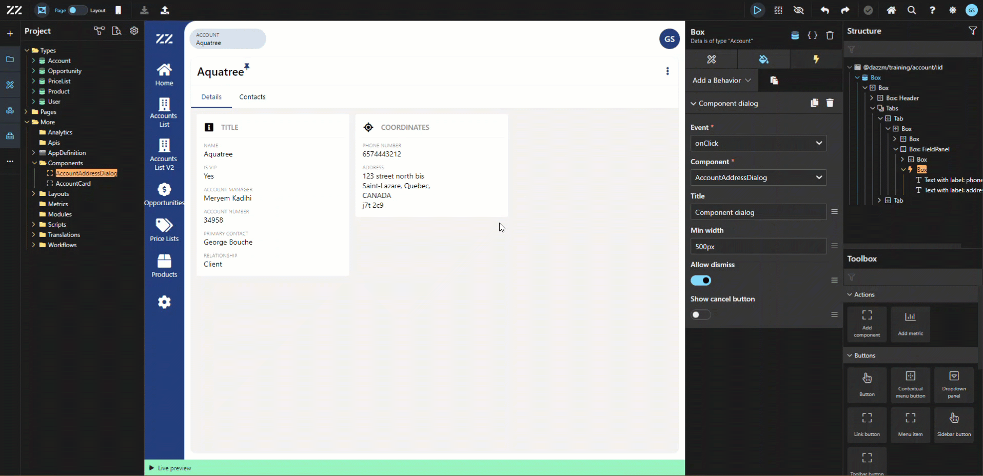
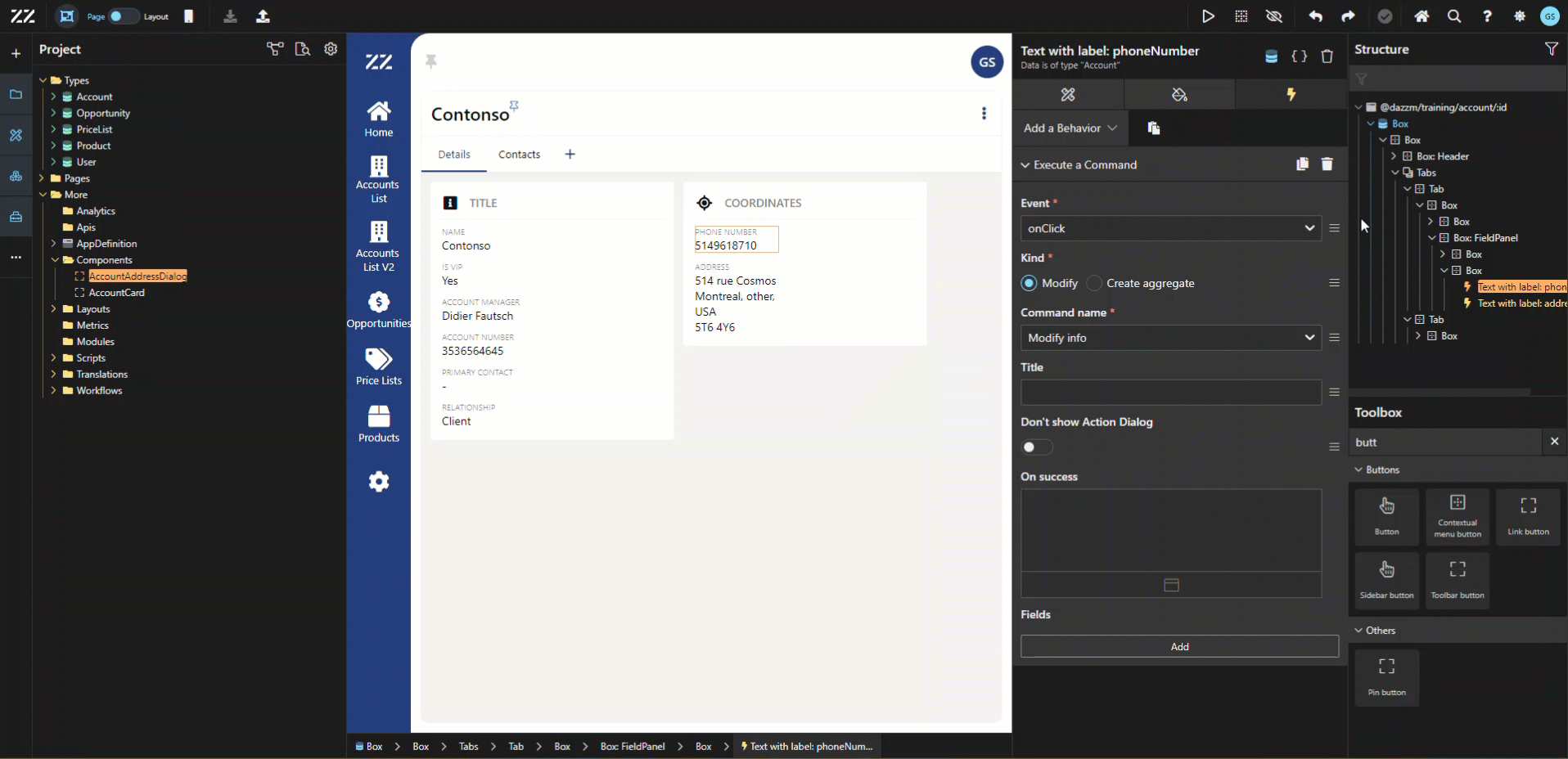
1. Applying the Reusable Component in the Detail Page
Section titled “1. Applying the Reusable Component in the Detail Page”To apply our reusable component in the details page of accounts, add a “component dialog” behavior to the box containing our address information fields. Pick “onClick” at the event and select our newly created reusable component in the “component” drop-down menu.
Test it by going Live
Additional Tips / Notes
Section titled “Additional Tips / Notes”The “allow dismiss” option, once activated, allows end users to simply click outside the dialog to close it . The option to “show cancel button” has been deactivated because, in our example, the cancel button was added manually, for styling purposes.
Conclusion
Section titled “Conclusion”Customizing a dialog with an embedded form provides a flexible and space-efficient way to manage account information. By combining reusable components with custom styling and behaviors, users can streamline data input processes, resulting in a more dynamic and user-friendly interface.